ink

The elusive Louis Vuitton ink

A while back I found out for one of my favorite fashion brands (As long as you skip the monogram things) Louis Vuitton, Actually had ink for fountain pens. I was quite surprised, but of course I just needed to get a hold of a bottle of their ink. Especially as the bottles looked amazing.

There was however a problem, the inks seemed impossible to find. I looked in a physical store and also in different online stores (different countries have different offerings), but to no avail. I even called the Swedish branch, but they couldn't get a hold of any ink either. Then I remembered that my brother's girlfriend actually worked at their head office in Paris, so of course I also asked her. The answer I got was however once again a no.

The thing was however but that's what's all the rouse, Instead she and my brother got a hold of a couple of bottles of ink and brought them to Sweden as a gift the next time they visited. I must say that this may have been the best gift ever.

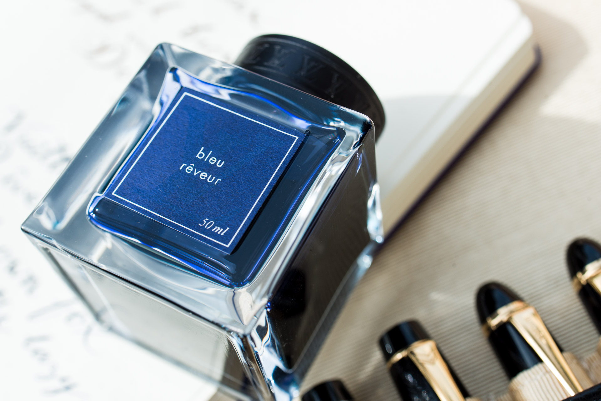
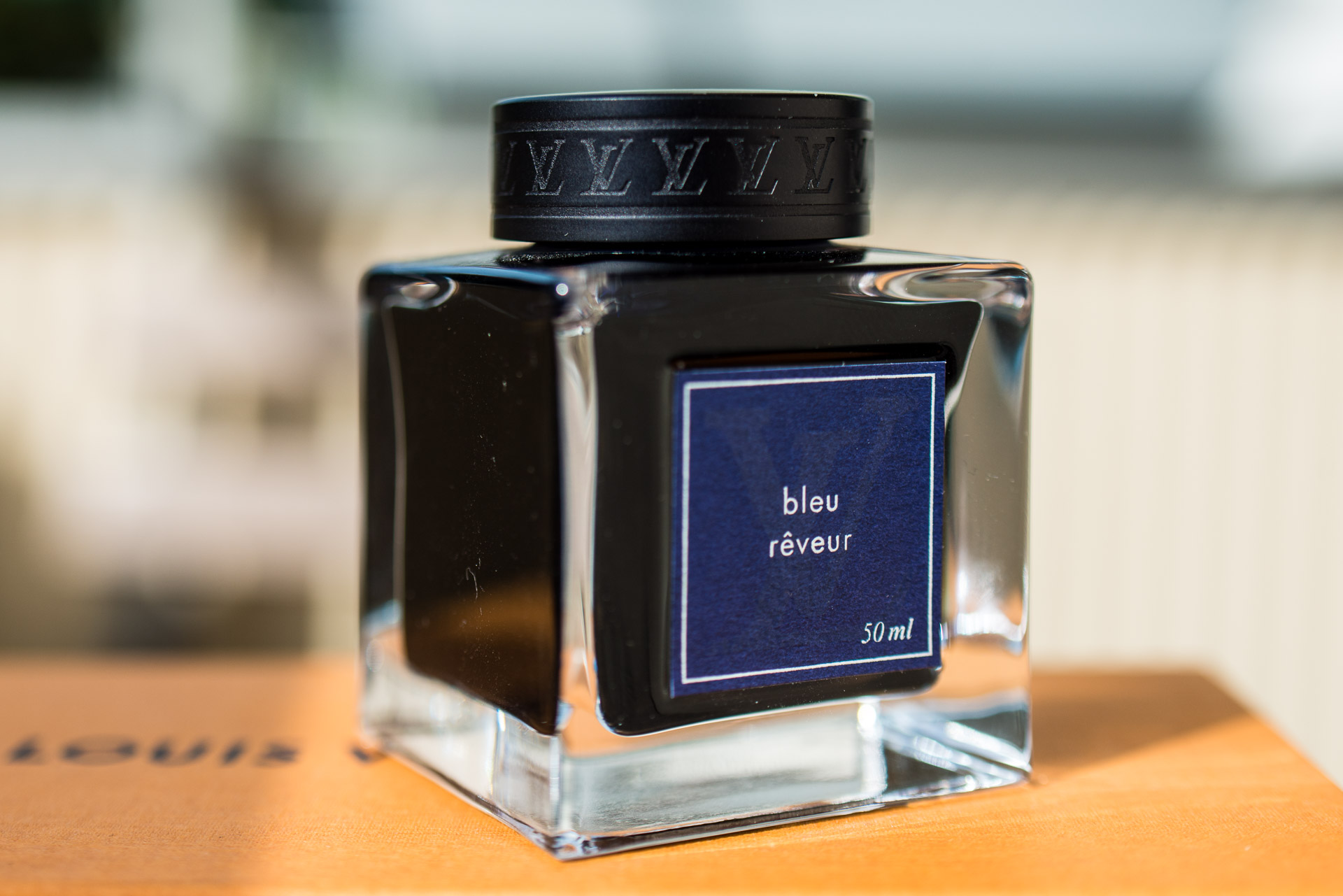
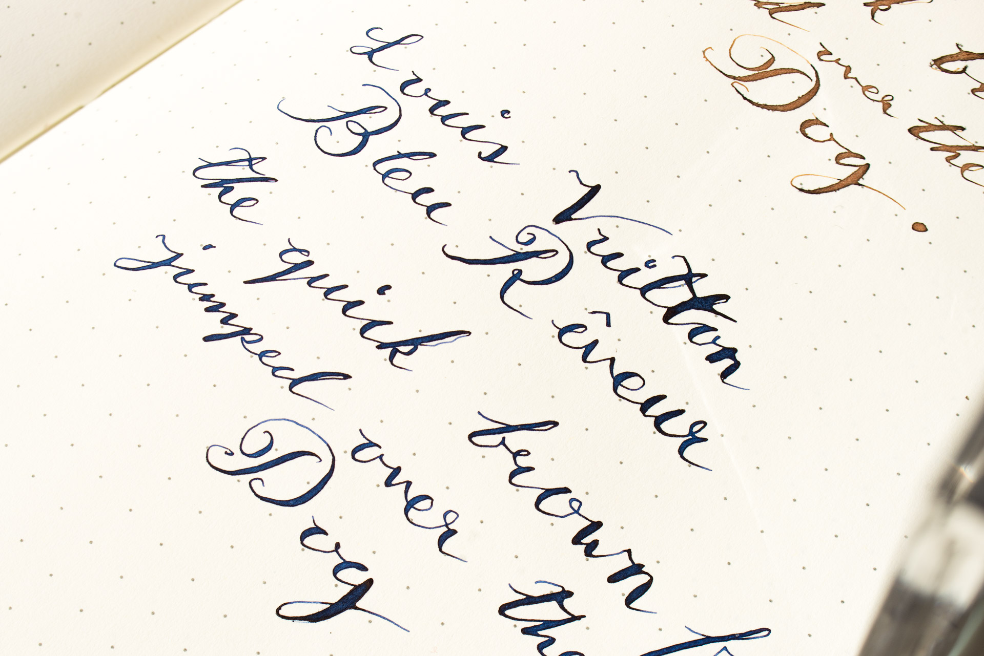
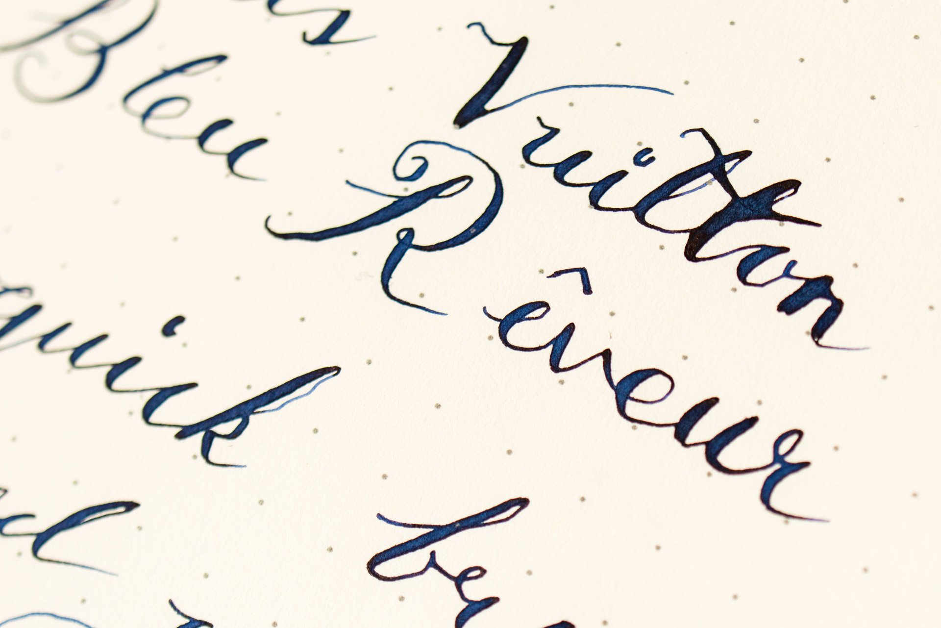
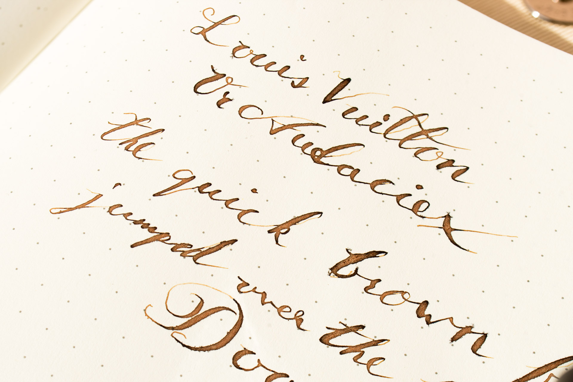
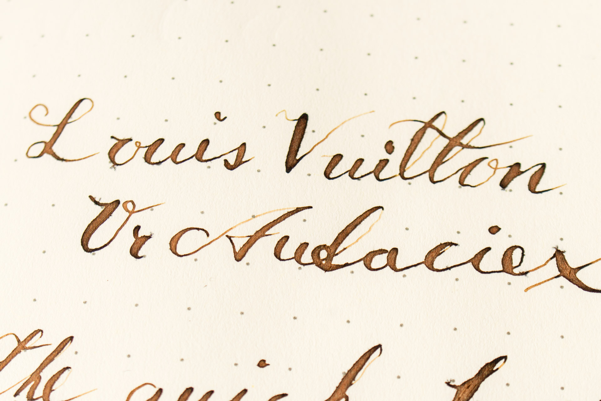
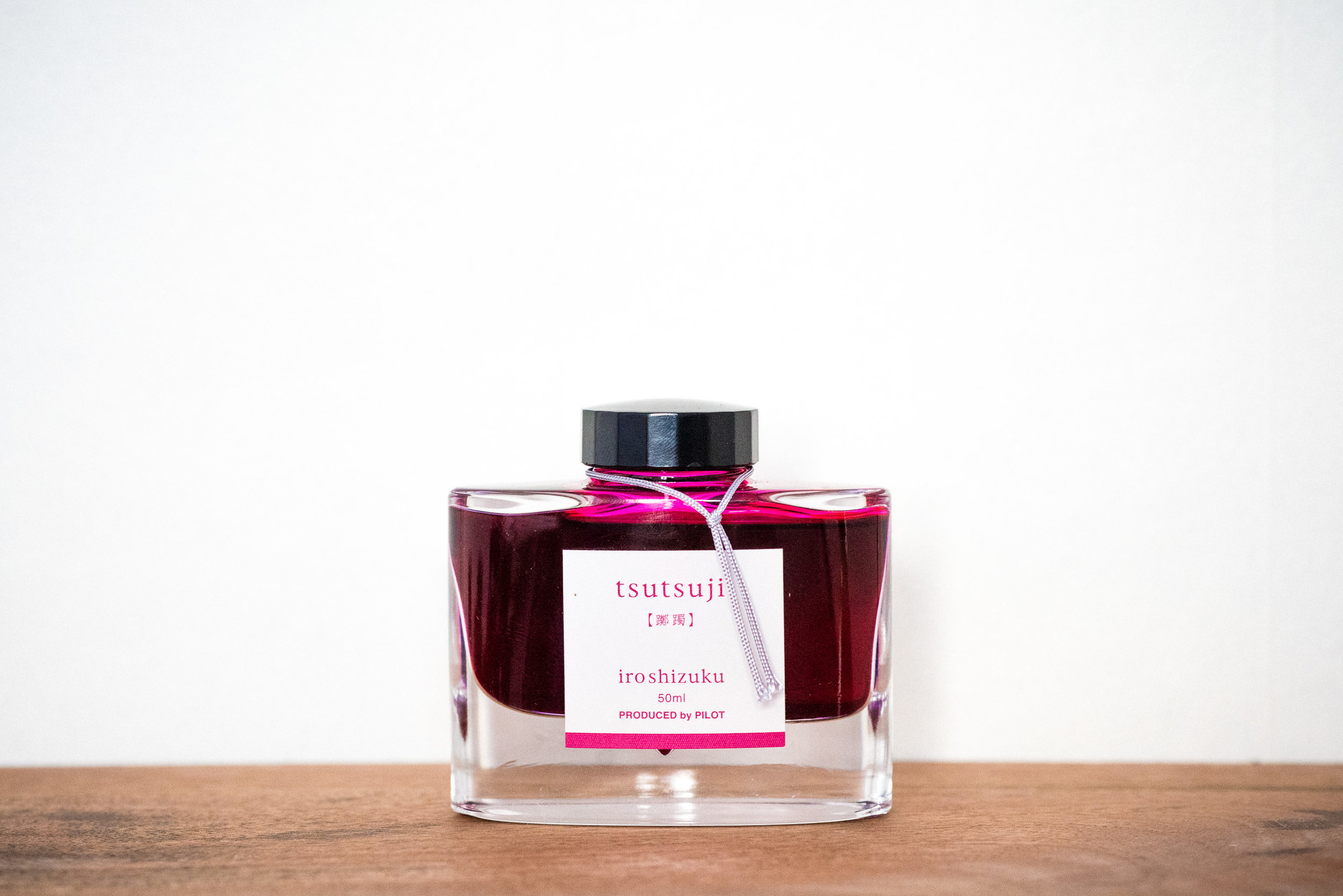
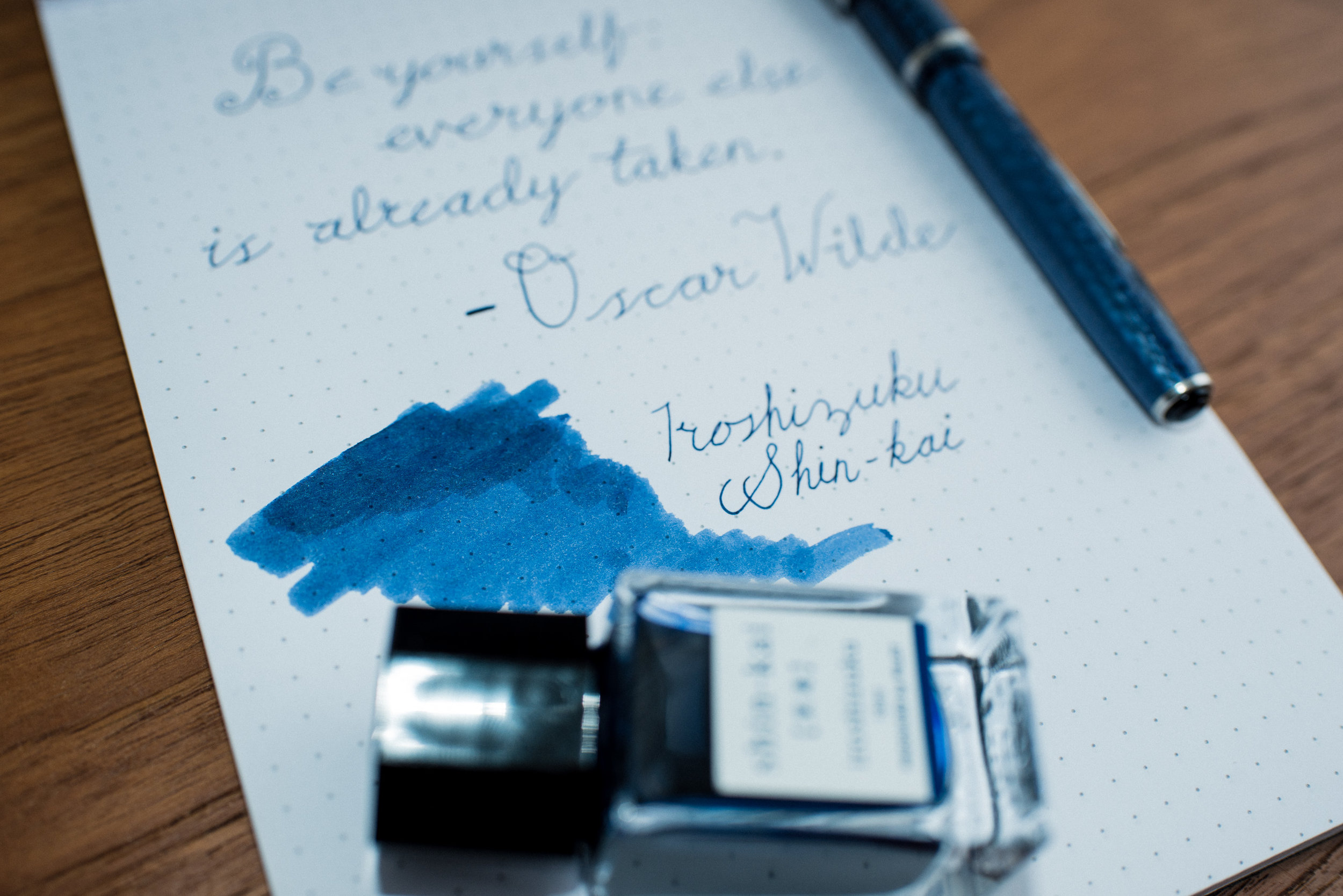
The two inks I got were Bleu Rêveur (Dreamy Blue) and Or Audacieux (Audacious Gold) and even if I won’t do a review of them here I must say that Bleu Rêveur went up to one of my top blue inks ever, and I have a lot of blue inks! Both inks are wet, well behaved and the blue has really nice shading.

Mixing your own inks

Ever since I started using fountain pens I have been searching for the perfect “standard ink”. A beautiful, yet subtle everyday ink that I never get tired of even if filled a whole notebook with only that ink. For me that ink is without a doubt a blue black ink, I’ve always hated blue pens and instead bought pens with black ink, but to be fair, black is quite boring. That’s is why I love blue black inks, they are almost like using a black ink, but with some character!

I really can't say exactly what a perfect blue black ink would look like, but I know that I haven't found it yet. The closest I've come to finding one is the fairly new Aurora blue black, but it isn't perfect. It has an amazing color and it’s neither too bright or too blue, which is the case for most blue blacks. The Aurora ink also has some great shading and some red sheen, which is something I love and absolutely want in my everyday ink. The one thing that could be better for me is if it was a bit darker, maybe not as dark as another favorite, Diamine 1864 Blue Black, but almost. I would love a mix between does two inks, A little brighter 1864 with the sheen from the Aurora ink would be my perfect blue black. That brings me to today’s real topic, mixing my own ink.

As one does, I started to google the topic and one thing became clear straight away, the safest way to mix inks was to use only inks from the same brand, and preferably also the same series. Of course it is possible mix inks from differents brands, but the consensus seemed to be that things could go wrong if one were unlucky, so the safe bet was to use ink from the same brand.

As I'm just starting out I decided to use Diamine inks, as the small 30 ml bottles are so cheap that you can buy a lot of different colors to mix with. Here you can see some my first tests where I decided to use Sargasso Sea as the blue component because of the sheening properties of the ink. Sorry to say that the sheen seem to disappear when I mix it though. I've also tried to mix some Sailor inks as I love the properties of those inks. The first test with a 50/50 mix of Sailor Yama-Dori and Sailor Shigure actually became super nice and I use it regularly now. All I can say that it has been fun so far and that I’m far from finished with this project. I'll update you when I found the perfect blue black, but until then, why not try it yourself?

I love Ink bottles

One of the things that I like the most about fountain pens is that I can buy nice looking ink bottles to put on my desk. There are just so many beautiful bottles that I often buy new ink just to show them of as decoration at home. Of course I also try to find an ink I like and “need”, but the bottle design actually comes first sometimes.

Just take a look at the bottles above!!


My first vintage pen

A while after I started to get into fountain pens I turned to the Swedish version of eBay, Tradera, to see what could be found there. I found a bunch of cheap pens from brands I hadn't heard about, and brands I had heard about, so I started to bid. I really wanted to try out some cheap old pens to try different filling systems and learn more about how the pens functioned so I could fix them if I needed to. I also wanted more pens to be able to try out more inks.

The first pen that I got in the mail after a winning bid of about 17$ was this blue Esterbrook J and after I got a some more vintage pens I quickly realised that this pen stood out from the crowd. The pen is from around 1950 and except from some scratches on the nib it is in almost unused condition.

The most interesting thing about the pen isn't how beautiful it is though, it is that it writes amazingly! It is actually one of my absolute favorite pens and it is actually much better than many modern pens I have, and have tried. 

It is a small pocket pen and after some research I learned that it has a nib that can easily be swapped out. There are apparently a huge number of different nibs to choose from and mine (with the number 9550) is one of the extra fine nibs for small notes. I think that is perfect because of the pens size and it happens that I take this pen with me as a note taking pen instead of my Pilot E95S (a 140$ pen) because it is at least as good. 

Of course I also matched the color of the pen with the ink (Pilot Iroshizuku Shin-kai) because why not? 

Color matching accessories

I love color, especially vibrant colors. In spite of that my wardrobe actually mostly consists of black/blue suits and white shirts. The reason for this is that even if I love color it can be a bit much with a pink suit (but yes, I do own one of those!) and my wardrobe would need to be HUGE if I wanted clothes in strong colors and still be able to mix and match a bit. Especially when you think about all the different shades of every color that doesn't match with other shades of the same color. And to be fair, who has the space for suits in 50 shades of gray?

Instead I try to pick up a lot of accessories in all different colors. these aren't to expensive and they don't take much space at home. It is also super fun to color match all the different accessories with each other to get a colorful outfit even with white shirts and black suits.

This is why I always try to pick up new ties, pocket squares and cufflinks when I find one that I like, and after that the hunt begins! The hunt for other accessories that can be matched with the one I just bought that is. Sometimes I also try to bring my new accessory with me in case I get the time to go into a store and look for things that match, it's always a lot easier to find something that matches when you actually can compare the colors. 

Pattern matching (if you don't look to closely).

Of course it is even nicer if I can find something that not only color matches another accessory but also can be matched with something else. One example is to mismatch colors but instead focus on patterns, but there are many different ways to match. I just happen to love color matching a bit more than all other ways of matching. 

One of my latest idiotic ideas is to also try to match the ink in my pen to the colors I wear haha!